Here is for you my first selection Dribbble.
Dribbble is a community platform allowing the user to share their work. Many web designers use this platform to present their work.
Regularly using this platform for my digital watch, I make the choice to share my discoveries with you.
This first selection is dedicated to landing pages. But above all, a landing page (or landing page in French) can put an offer forward while waiting for the visitor when a site is developing for example.
Animations for simplicity

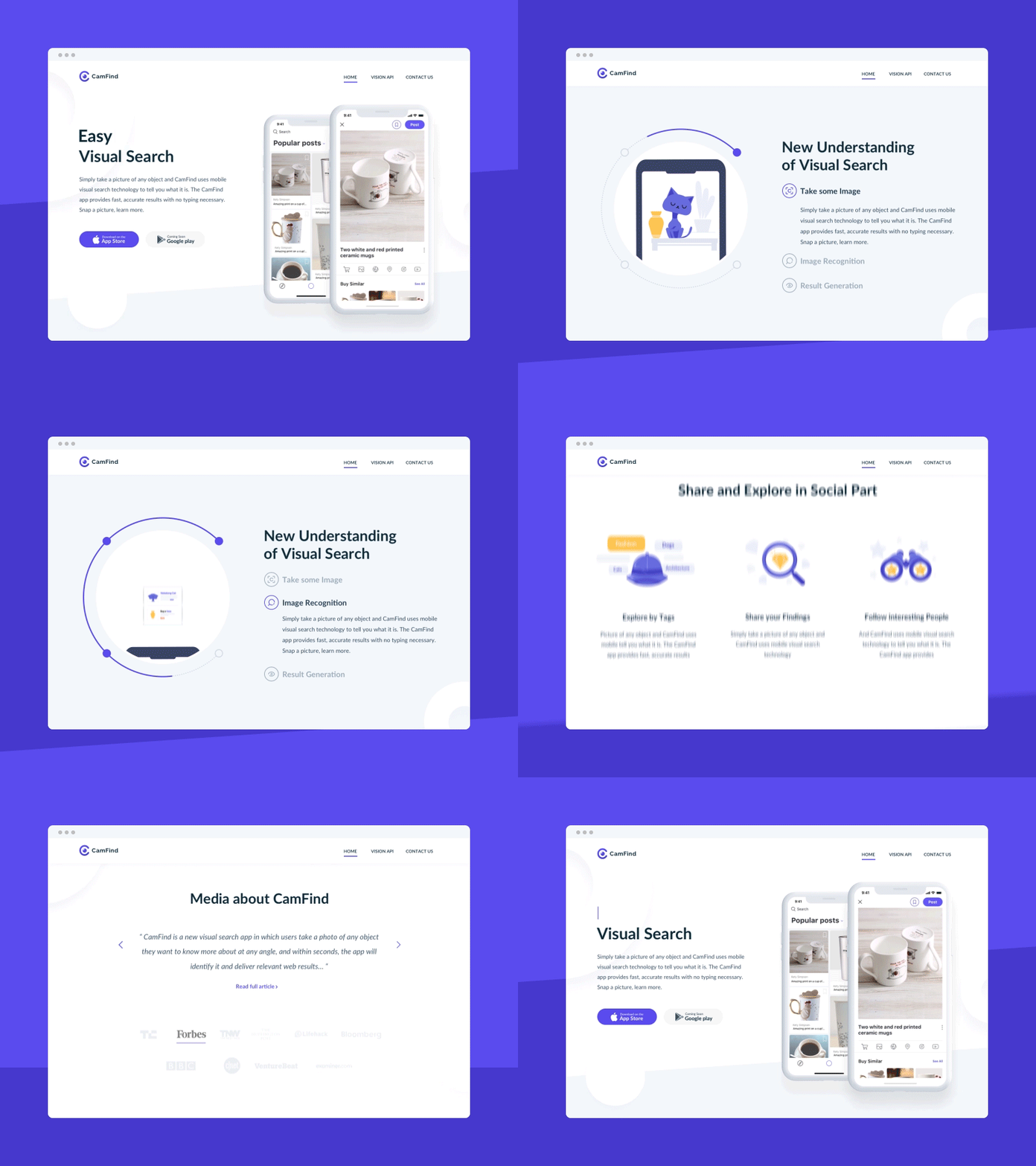
First of my selection, the creation of Selecto living in London. The author plays on animations to simplify the visitor’s understanding.
Just what you need !

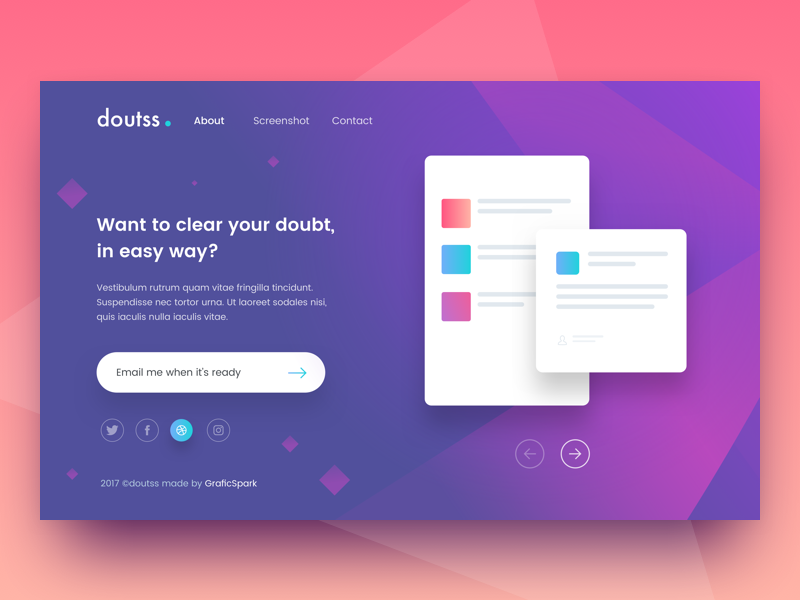
Simple and efficient. Vijay verma living in Delhi in India offers us a simple interface: a title, a text, a button, and a picture (or slider). Not to mention the links to social networks.
Animation and scroll

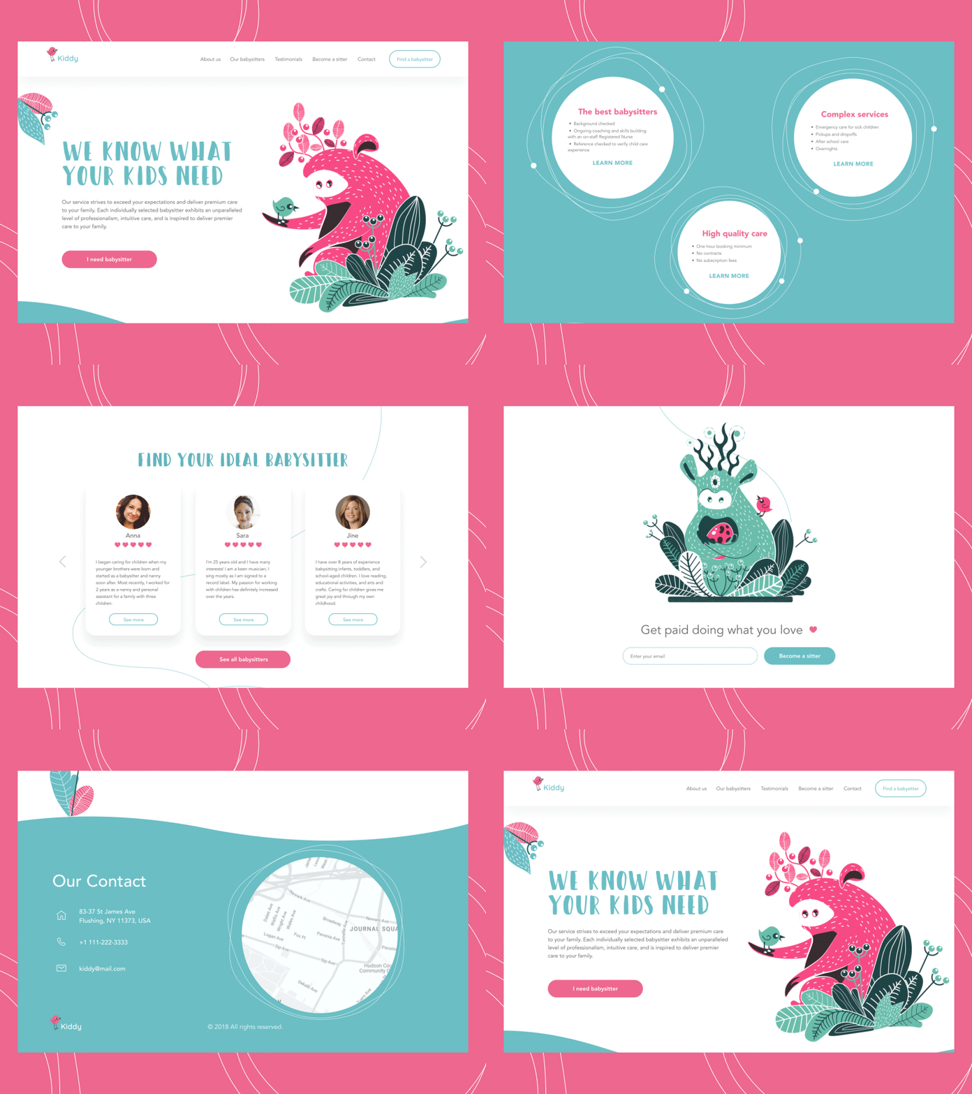
Tubik living in Ukraine offers us a landing page very well done. While remaining simple, the designer plays with animation and scroll which allows the visitor to understand the project efficiently and quickly.
Simply …

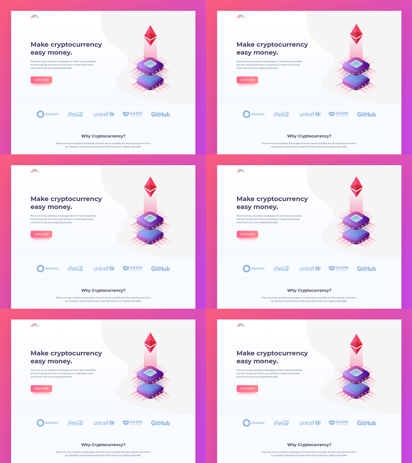
Like Vijay verma, Manoj Rajput offers a simple and easily understandable graphic chart while making partners visible at first sight.
In conclusion, designers can give all forms to landing pages. The simple rule to respect is the simplicity of understanding while being pretty (and even animated).

